Scatter plots and linear models
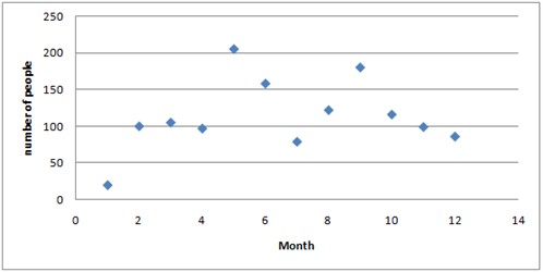
Let's say that you've the first of every month for one year been counting the amount of people on a subway platform each morning between 9 and 10 o'clock. You've summarized your result in a table.
| Month | Jan | Feb | Mar | Apr | May | Jun | Jul | Aug | Sep | Oct | Nov | Dec |
| Number of people | 20 | 100 | 105 | 97 | 205 | 158 | 79 | 122 | 180 | 116 | 99 | 86 |
You can treat your data as ordered pairs and graph them in a scatter plot.
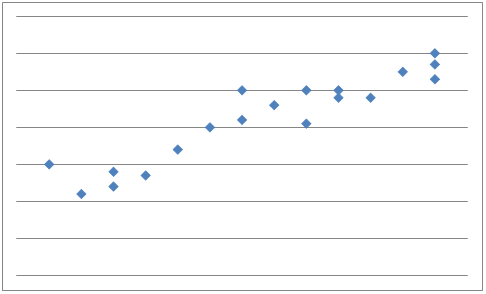
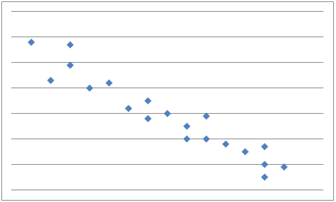
A scatter plot is used to determine whether there is a relationship or not between paired data.
If y tends to increase as x increases, x and y are said to have a positive correlation
And if y tends to decrease as x increases, x and y are said to have a negative correlation
If there is, as in our first example above, no apparent relationship between x and y the paired data are said to have no correlation and x and y are said to be independent.
From a scatter plot you can make predictions as to what will happen next. To help with the predictions you can draw a line, called a best-fit line that passes close to most of the data points. Approximately half of the data points should be below the line and half of the points above the line. If the data points come close to the best-fit line then the correlation is said to be strong.
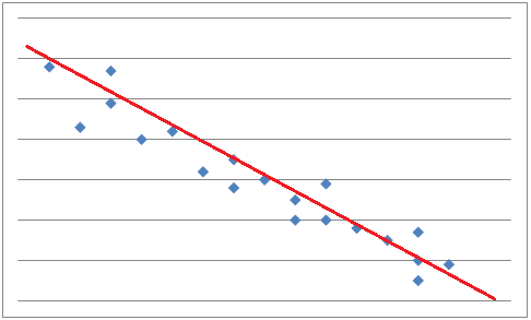
To find the most accurate best-fit line you have to use the process of linear regression. For this you have to use a computer or a graphing calculator.
When you use a line or an equation to approximate a value outside the range of known values it is called linear extrapolation. The further away from the known x-values you are the less confidence you can have in the accuracy of the predicted y-values.
Video lesson
Add the data in a scatter plot and determine whether there is a correlation or not between x and y
| x | 1 | 4 | 5 | 7 | 9 |
| y | 14 | 34 | 27 | 40 | 38 |