Circle graphs
A circle is the same as 360°. You can divide a circle into smaller portions. A part of a circle is called an arc and an arc is named according to its angle.
A circle graph, or a pie chart, is used to visualize information and data. A circle graph is usually used to easily show the results of an investigation in a proportional manner. The arcs of a circle graph are proportional to how many percent of population gave a certain answer.
Example
An investigation was made in Mathplanet high school to investigate what color of jeans was the most common among the students. This circle graph shows how many percent of the school had a certain color. We now want to know how many angles each percentage corresponds to.
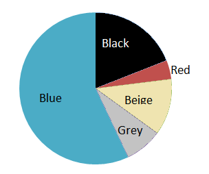
To find out the number of degrees for each arc or section in the graph we multiply the percentage by 360°.
$$Blue\: 57\%: 0.57\cdot 360^{\circ}=205.2^{\circ}$$
$$Black\: 19\%:0.19\cdot 360^{\circ}=68.4^{\circ}$$
$$Beige\: 12\%:0.12\cdot 360^{\circ}=43.2^{\circ}$$
$$Grey\: 8\%:0.08\cdot 360^{\circ}=28.8^{\circ}$$
$$Red\: 4\%:0.04\cdot 360^{\circ}=14.4^{\circ}$$
When we want to draw a circle graph by ourselves we need to rewrite the percentages for each category into degrees of a circle and then use a protractor to make the graph.
Example
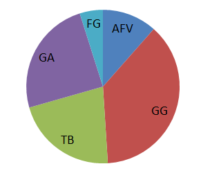
If we ask 100 persons which TV program they like the most, we get this result.
| TV program | Persons |
| Grey's anatomy (GA) | 17 |
| Family guy (FG) | 34 |
| True blood (TB) | 15 |
| Gossip girl (GG) | 26 |
| America's funniest home videos (AFV) | 8 |
We know that the total amount of persons is 100. Now we need to find the ratio for each TV program.
$$GA:\frac{17}{100}=0.17$$
$$FG: \frac{34}{100}=0.34$$
$$TB:\frac{15}{100}=0.15$$
$$GG:\frac{26}{100}=0.26$$
$$AFV:\frac{8}{100}=0.08$$
To find the degrees of each TV program we multiply by 360.
$$GA:0.17\cdot 360^{\circ}=61.2^{\circ}$$
$$FG: 0.34\cdot 360^{\circ}=122.4^{\circ}$$
$$TB:0.15\cdot360^{\circ}= 54^{\circ}$$
$$GG:0.26\cdot 360^{\circ}=93.6^{\circ}$$
$$AFV:0.08\cdot 360^{\circ}=28.8^{\circ}$$
And then we use a protractor to draw the chart. It will look something like this:
Video lesson
Find the values in degrees